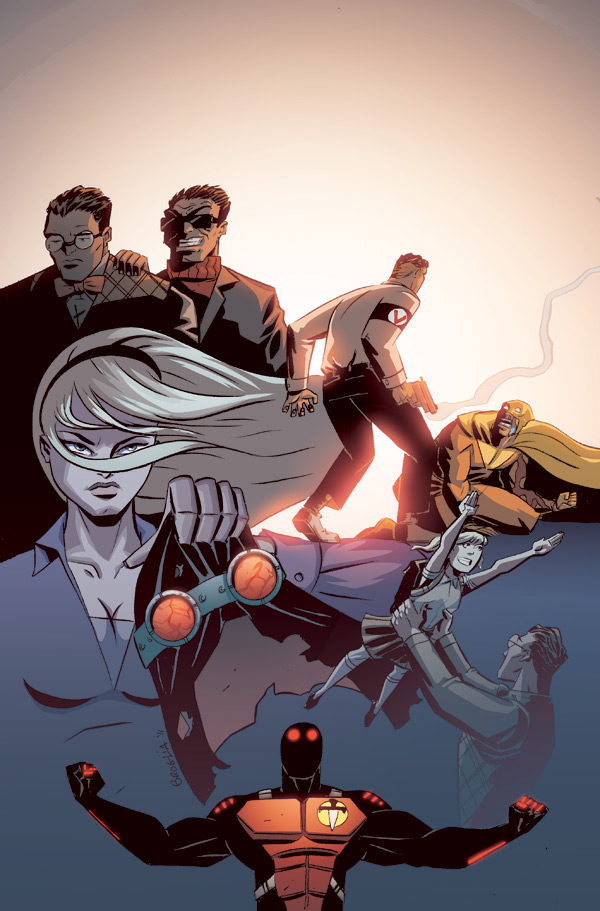
Thank you for the amazing compliment! And as always, criticism is certainly welcome. I kind of fibbed a bit when I posted this art. Its not promotional art, its actually a cover for the series.The reason for the empty space up top is to leave room for the title. We'll keep this little secret between us lol.

2 comments:
It's really very hard to crit your work. Especially so on this Unmasked project because 99% of it is just flat out awesome.
But A-ha!, I spy room for improvement in this image.
I like the "heat" in the center of the image and the "cold" at the bottom but the top of the image seems blown out...
The composition in the upper 1/4th? It seems like it needs some sort of connective structure like a building, a dawning sky or even someone falling.
Thank you for the amazing compliment! And as always, criticism is certainly welcome. I kind of fibbed a bit when I posted this art. Its not promotional art, its actually a cover for the series.The reason for the empty space up top is to leave room for the title. We'll keep this little secret between us lol.
Post a Comment